
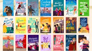
If you have been in a bookstore lately (and I confess, I have not…I seem to be hellbent on enriching Jeff Bezos, possibly even sending him off to space again), you will have noticed a relatively new trend in book covers. Some, especially cozy mysteries and romances, have been cartoonized (Yes, I know. Not a word.). Nearly every recently-released book has a colorful, almost child-like cover. Shelf after shelf look candified (also not a word).
My own Lady Adelaide mystery series is an example of such cuteness. After the first book (whose cover I love) came out, the publisher was purchased by another company. They did not like Book #1’s look, changed the fonts for Book #2 and threw Lady Adelaide into a roadster at night in sunglasses. I thought she looked dashing if a bit misguided, and didn’t mind much. I’m now humming “I wear my sunglasses at night…”

Then came Book #3. The first cover choice was pretty awful, with a smarmy, Fedora-ed, mustachioed man who bore no resemblance to my detective hero. My first thought: Snidely Whiplash has moved from 19th c. railroad tracks to a 20th c. nightclub. My editor and I both objected. We convinced the powers-that-be to get rid of the guy and let Addie drink tea alone instead of a bottle of hooch. That the tag to the teabag is dangling from her cup I tried to ignore. No proper Englishwoman—and she is every bit that—would permit such sacrilege. But if you look reeeally closely, there is a tiny skull and crossbones on the tag, which is a clever touch.

Book #4 is perfectly fine, even though there are autumn leaves everywhere and the story takes place in June. The characters appear to be wearing clothes with a 1930s silhouette instead of the 1920s, but perhaps some time travel was involved to get a glimpse into their future.
You can tell I’m a little picky, and probably most readers wouldn’t notice or care. Except…people who read historical-set books are usually very well-versed in what is appropriate for the relevant time period.

In my previous authorial life, I wrote romances. Some years back, I gasped in dismay when I saw the cover for Lord Gray’s List. It wasn’t because I’m prudish and don’t appreciate an anachronistic waxed and oiled chest. I’m only human. But here is Lord Benton Gray in 1820, posing half-naked in a button-down shirt that had not been designed yet, along with the Houses of Parliament.
Interestingly, the foundation stone for that building wasn’t laid until 1840, and the entire Palace of Westminster was finally completed around 1870. Lord Gray was a man ahead of his time, wasn’t he? I am just grateful that the art department didn’t throw the Gherkin and the London Eye into the skyline. And we won’t examine too closely where Big Ben has been placed relative to hero Ben. There is a certain lack of…subtlety.
For a while, there was a “headless” trend on covers, which suited me. I like backs-only too. I prefer to imagine the protagonists myself, and find it difficult when the faces on the front don’t match the vision in my mind. Blood spatters seem popular now—a grim sign of things to come, no doubt.
Do you pay attention to covers? What catches your eye? Does a “bad” cover ever turn you off from buying the book? I absolutely adore the look of the latest Lord Peter Wimsey editions. Very stylish!


More information about me and my books can be found at maggierobinson.net. If you’d like a Lady Adelaide series bookmark or two, please email me: maggie@maggierobinson.net


There is an annoyingly similar trend in cartoonish covers for juvenile fiction that does zilch for me. Thankfully it hasn’t made much of a dent in YA fiction. Covers in that genre are generally dead on, some even fantastic. Do you suppose there’s a CDM (cover designing Morons) churning out these nitwits?
LOL. I keep reminding myself we’ve lived through a lot of trends and can probably survive more.
I agree, most disturbing that authors have no say in their covers. And the historical anachronisms – screaming “hate” inside here. I feel lucky that my publisher asks for input. (They ask me to send them 5 covers I hate and 5 covers I think are good inspiration for my book and then send me the cover they come up with and if there is a grand visceral negative reaction (which there hasn’t been) let me voice it. On my last book, I asked them to change a detail – and they did. One of my first academic (college textbook) books (16 years ago) – the cover was passed by me (by a textbook publisher who is now out of business) and it was a cartoon-isn nightmare that had nothing to do with the college-appropriate text inside. I had to beg – asked them how could I assign this book to college students who had to carry the book around campus (and possibly get laughed at). They changed it – to some other cartoon-y image but at least it wasn’t as bad and it did relate to screenwriting. I don’t fancy myself an artist at all – but I do “know” when something is not appropriate – as any writer of the text would know. As always – sometimes the initial creator is the last to know –
Yup. Most of the time the cover is presented as a done deal, unless you’re extremely lucky or a megastar. I was never brave enough to speak up until Snidely arrived. I have a 3-book Victorian series with the heroines in Georgian dresses–very pretty, but nope.
Thanks for coming up with the word to describe those covers–cartoonish is perfect. Some I like, some I don’t. On another note, my first historical novel was based on the life of Libby Custer. In the hands of a New York publisher, the cover showed Libby standing in a field of knee-high prairie grass (think Kansas) by a barbed wire fence (just barely introduced when Custer died, so surely not all of Kansas was fenced). In the background was a timbered fort on bare, red ground (think Arizona where there was never the wood for a timbered fort). As a final blow, a book designer friend said Libby looked like Madonna in a nineteenth-century costume. I was green–who was I to argue with NY?
I totally feel your pain. Poor Libby!
As a reader and buyer of new books, I have noticed the trend. My preference is hardcover over softcover mostly for durability and dust jackets for those are usually more traditional. Unfortunately for me so many books are softcover these days. Cover art and title are important, especially for a new author trying to get noticed in the deluge of new releases. And Maggie, you are absolutely correct. We readers DO notice inconsistent cover details! We also are smart enough to know that it isn’t the author’s fault
I spent a lot of time as a library clerk covering softcover books with that plastic stuff, so I understand the durability issue. Kind of like clear wallpaper, bubbles and all. It really does help, though, and I got to be pretty good at it. And thanks for recognizing authors are usually helpless when it comes to covers. I know art departments do their best, but sometimes…
Maggie, I’m with you on the frustration about cover art. As for Lord Gray, even the readers who care about the historical accuracy were probably so taken by the man’s chest, they forgot to check. I too suffered from what I considered terrible covers. In one of my Harlequin covers, my heroine appeared to have an extra leg. On the other hand, I do like the new Wimsey covers. Thanks for this clever post.
An extra leg! I know there’s a famous Christina Dodd cover with an extra arm, LOL. Crazy stuff.
Years ago, when Tor/Forge was my publisher, they didn’t wait for my input and some of the covers were so awful I was nominated for, I think it was a Raven award for worst covers. A well-deserved nomination. The cover of the paperback of my first Thea Kozak mystery, Chosen for Death, was so awful I used to shudder whenever I saw it. Certainly the designers don’t read the books. Next, Maggie, how about that horrible cover copy?
Kate
Oh, how awful to have your book shamed, even if it was “well-deserved.” For me the major plus of self-pubbing is control over the cover, although the rest of the associated tasks confound me.
I’m not sure I’m equal to take on the challenge of critiquing cover copy–some of mine have had been great; others, not so much. I’ve had input on some, but it really is HARD to condense a book into a couple of sentences. I’d rather write the whole book, LOL.